

Today I’m back and talking covers again. And yes, it’s because I’m holding the Best Historical Romance Cover Contest over on the website . (Oh, and don’t forget to vote). The contest got me thinking about the one thing that hits readers first. The cover.
Now, I initially set out to do a different kind of post. I was going to put up several beautiful eye catching covers and give my reasons why I think they work. But Katiebabs did a wonderful post on that earlier this week (check it out), so I thought I’d approach this from a different angle. I’ll go back, hmmm, oh, about 32 years to the Mother of romance, Harlequin Books. So how have Harlequin Historical covers evolved, you ask? Take a look.


Starting from the left, we have a 1977 cover from Harlequin Historical. The first thing I noticed about the cover of THE RUNAWAYS was the man. Is it me or does he look…well, dare I say, old? But when I looked back on that time in Harlequin’s history, the hero was always much, much older than the heroine. I remember in the Presents line, no one blinked an eye at a 19 year-old heroine with a man twice her age. You don’t see that May/December kind of thing in contemporary romances anymore.
Skipping ahead 10 years to 1987, you see that Harlequin has adopted a slightly different look with their covers. A decade didn’t change the way the hero always seems to be assisting the heroine as she goes into a swoon. Harlequin also appeared partial to the bottom image of the embracing couple (Note castle and ship) Our hero of BUCCANEER BRIDE is sporting a full beard and mustache. You don’t see that often. But then he is a buccaneer and probably has little time or desire to shave. And as mediums go, Harlequin seems to have moved away from something that looks more like water color paintings to sharper, more vivid oils.
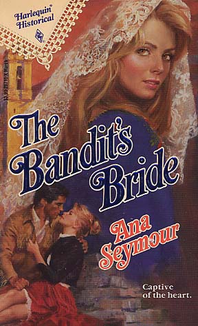
In 1992, we see from THE BANDIT’S BRIDE, Harlequin’s preference is now a large top picture of the heroine, and below, the embracing couple (embracing means they love each other). And is it just me or does the cover even look historical? Her hair, their clothes? I’m only now realizing the initial reason I thought it looked dated was because I was thinking in terms of a contemporary. Yes 1992 was fifteen years ago but this should look a lot older then that by some, hmmm, 100 years. 🙂


In the year 2000, they gave us BY QUEEN’S GRACE and ONCE A HERO. The bird? Well, I have no words as I’m sure there is a logical reason that everyone gave a thumbs up on the bird. (No, not give them the bird!) And have you ever seen a more earnest boyscout–I mean cavalry soldier? I say he’s a true hero indeed.
In 2005, on the cover of Terri Brisbin’s THE KING’S MISTRESS, they moved to chopping off heads. What survived. Yep, that second lower image, and we’ve moved away from the embracing couple back to background scenery (remember the ship and castle from 77 and 87). That same year, Kate Bridges’ THE BACHELOR hit the shelves. I like this one. The hero is handsome, appears properly dark and brooding, and look at the lovely nature scene in the background, yes with the embracing cover (which, apparently they have not abandoned as I first thought). I’ve come to this conclusion, Harlequin loves nature scenes and the clinch. And who can blame them, right? I love ’em too.


Now in 2009, starting with the November covers, Harlequin Historical has gotten a gorgeous update and upgrade. The covers are, simply put, beautiful, the colors deep and vibrant. Sophia James’ MISTLETOE MAGIC makes me feel all Christmasy (Yes, it’s a word. Look it up.) However shallow this will sound, I’d buy this book simply because the cover shouts, ‘The Holidays are Here!” And Amanda McCabe’s THE WINTER QUEEN, on top of having a fantastic title, and even with the chopped off head, what an absolutely breathtaking period dress; the color just pops! Even the fonts and the backdrop for her name is perfection. I love, love, LOVE what Harlequin is now doing with their covers. I’m also loving the new gold and burgundy HH ribbon hanging so decorously in the top left-hand corner. *Sigh* They definitely have come a long way…
So what do you think of the evolution of Harlequin Historical covers? Has anyone been reading them from their inception?
Two lucky commenters will receive either a copy of Amanda McCabe’s A WINTER QUEEN or Sophia James’ MISTLETOE MAGIC.
Next week I’ll be mapping the evolution of a certain author’s covers, whose publishing homes span from Dell to Simon and Schuster.
I just love romance covers 🙂 Then and now!
The old covers bring back memories of days gone by, yes, I remember them 🙂 The new ones are what I would be reading now. The covers have evolved & I am glad because they fit into the competitive market. You want to read the books because unfortunately people still do judge a book by its cover. I look at the titles & covers & then decide whether to pick it up & read the back. I would not be like;y to pick up one of the old covers today.
plb8156@aol.com
I just started reading HH a few years ago and from looking at the covers I like the current day covers a lot better!
Great article, and so much fun to see the covers over the years. Interesting about the men looking so much older in the earlier ones, but it might have something to do with the hairstyle too. I too love the new covers.
Ann
Interesting to see the evolution. Definitely better today, but the old ones go w/ the times. I’ve read them off and on over the years, but I must admit, I generally read the back on every book and make my choice from there, a beautiful cover is just a bonus!
You are so spot on! I am a “book cover lover”. For me, a poorly done book cover is a disaster. It detracts from the story when the cover does not match the characters and story line in the book. The authors must go nuts when they are stuck with a junky cover! On the other hand, sometimes the covers are better than the books. As for Harlequin, they just keep evolving. Even they occasionally make a misstep, but they just continue to move forward. You are right, those seventies covers from Harlequin featured some hard-faced older men. I was in my teens during those years, and I was attracted to older men. Now that I am older, not a “cougar”, just gently-aged, I like “eye candy”. I have developed a sweet tooth : )
I *heart* the new covers. 🙂
I’m with Ginger C on being a book cover lover, and looking at the evolution of those covers I do prefer the more modern ones :]
We look at old pictures and say what was i thinking wearing something like that or wearing my hair like that. covers are pretty much the same way like us changing threw times. Strange but true, alot of us back then liked older men so i guess thats what they thought would apeal to us women. you have to have a cover that would attract the reader. but as the times change so do peoples taste. i personally love the new covers. the christmas ones are great, because you know that feeling you get around christmas? when your walking in the store buying presants christmas music is playing on the loud speaker you stop at the book isle and what do you see? Mistletoe Magic by Sophia James, Yes the perfect book for a perfect holiday! not only do you get your self one but you buy a few more for your reader friends christmas gifts. & as for the ones with the dresses on them i think thats wonderful because as your reading and read about what the women are wearing you can invision the dress in your mind but when you look at the cover it helps to see the dress better, humm maybe a diffrent color or change this or that. i love the look at the older dresses so elegant and beautiful. makes me wish i could go back to those times just to wear the cloths and jewelry.
I been reading the HH for a long time now and I love them I also enjoy reading the inceptions.
I love the covers and the old one too I do miss them
Penney
I actually like the old and newer covers. I think the only real difference is that the newer covers have brighter colors and the use of the newest technology. The old covers bring a sense of nausea though especially with the historicals. They look like they were printed and drawn around the same time period they were supposed to have taken place. Though it would have been very improper to depict such scenes except in pin up cards. ^w^
I don’t know if it was the stigma attached to Harlequin novels when I was growing up but I have a hard time picking up any Harlequin novel. Don’t get me wrong, I have read several but usually I didn’t know they were Harlequin novels. One of the main reasons I can attribute to staying away from them are the covers. I am a very visual buyer… if I don’t like the cover I am not going to buy the book. I know I should listen to the sound advice I give my kids and not judge a book by its cover, however I just can’t bring myself to buy a book that has a ridiculous title or cheesy cover. I have noticed that the art department has stepped it up quite a bit in some cases but the books that fall into their series (I guess thats what they call them) still end up with some really cheesy covers.
All that being said I am loving the covers for the Sophia James and Amanda McCade books! They are truly beautiful!!
Wow, the covers have definitely come a long way! It looks like Harlequin has figured out how to attract readers’ attention in a good way. The covers for Mistletoe Magic and The Winter Queen are by far the most gorgeous in my opinion. Of course, I fell in love with the dress on The Winter Queen the moment I saw it, so that might have influenced my opinion some. 🙂
How fun to see the evolution of the Harlequin covers….since the first romance I ever read (in 1982) was a Harlequin I have a soft spot for them. I love what they are doing now with the gorgeous colors. But what is up with that bird?!?!
The old covers do bring back memories. I do love the new covers, though. They are vivid and make want to pick it up and read the story.
To riff off of April a little bit, re: times they are a changin’..
I think the covers are also reflective of the changing romance audience. Returning back to some of the older novels I read when I was younger (Sunfire romances anyone?) to the novels I read today, I have a similar reaction to April and the photographs. As the content and readership change, the covers change. I find it fascinating as a historical study, personally. 🙂 Thanks for posting these!
I love the latest Harlequin historical covers, especially the cover of the Winter Queen. The dress is so pretty that I don’t even mind the headlessness!
I haven’t been reading Harlequin since their inception, that was before I was born; however I have been reading Harlequin on and off for the last 15 years (yes I started reading them when I was 11) and although I’ve noticed the change of covers over the years, I at the same time haven’t paid that much attention to it.
I do think the newer covers are absolutely beautiful, but I also like some of the older ones ’77 and ’87 that you have posted. I’m not too keen on the ’92 cover though.
I try not to judge a book by its cover (I know cliché) but I do really look at Titles. Which in my opinion is better, because people can’t always show you a cover of a book, and if the book is reprinted it probably has a different cover anyway. But titles stay the same. So if some one mentions a title and it interests me then I do more looking and see if I like the story line, and while I’m doing that I will look at the cover and see if I like it. BUT I don’t make my final decision to buy a book on its cover.
Another problem I find with covers is they don’t always follow the story line. The main character in the book could be an overweight brunette, but on the cover they might show a lithe blond just so they can sell the book. Or how about one of the covers you have up, By Queens Grace, what does that bird really have to do with the story? From what I remember nothing, but I could be wrong I’ll have to go check and see if I still have the book so I can reread it and find out.
Well, Happy Reading all!
I really love Harlequin’s historicals covers.
Great post!
Even though the early covers were fun to look at, they look almost cartoonish. With evolution they look more artistic, more serious, more mature. They reflect a book you can take seriously.
I love the new covers for their colours. They’re far more vibrant but that may have something to do with printing techniques rather than choice. Maybe the older men in the earlier versions were due to the many novels about ‘older’ lords (often in their 30s) and their young wards (under age obviously).
I find the cover with the bearded buccaneer hilarious. Probably more authentic but not very sexy (IMHO). 😉
I liked the older hard-faced hero in the early covers, but the artwork of these new covers is beautiful. I don’t mind the headless bodies because personally when I read a book, I like to imagine (from the author’s description) what they look like. Plus it frustrates me when the art doesn’t match the descriptions. I don’t buy a book because of the cover but I do take a closer look if the cover catches my eye!
I have read Harlequin Historicals for many years, and I think that the covers are getting better and better.
I really enjoyed reading this blog. I never tire of discussing book covers, and the cover contest that you are having is a lot of fun. Maybe you could have a contemporary cover contest one day.
BTW, Punk Rock Penguin has a funny bad book cover page.
http://punkrockpenguin.net/waste/amuse/badcovers/
I like the covers!! I think they are beautiful.
The covers have gotten better over time. I enjoy Harlequin Historicals.
Nice blog today!! The old covers look old fashioned compared to new ones. I like the new covers better. Truth be told, I don’t spend a lot of time looking at covers!! Thanks, Sue
I’ve been reading the Harlequin’s since back in the day! I gotta say, I prefer the covers now. Some of the older ones were a bit misleading or dated….I am sad to say, I buy a lot of books now JUST based on the cover 🙂
I’ve been reading Harlequin Historicals for years. I love the recent covers on their books. They’ve had some beautiful ones.
A cover may draw my attention to a book but it’s the back cover blurb that clinches the deal if I’m not familiar with the author or the book.
I love the new covers–so classy and glossy–but I admit to a weakness for the 1992 cover. It declares the HH line is heroine-centric.
Except for the bird cover I like most of them. I like some of the chopped off head covers because then I can imagine my own hero or heroine. I also like the brighter covers. A cover lures me to a book but it’s still the back blurb that makes my final decision.
I always thought the covers looked too costume-like. But over the last year or so I’ve noticed their historicals are improving.
I love the covers they really have come a long way and yes I have been reading them for that long and loveing every book I read. Covers do draw me in and at this time of the years anything Christmasy will get me.
Have Fun
Helen
🙂 I was born in the 80’s and started reading Harlequins in the late 90’s…but I really LOVE the covers now. Some are soooo pretty and some are pretty hot! Woot Woot!
I think the cover are 100% better now than what it used be. The new covers makes want to read the books while old once just makes not even bother looking at it.
I agree, I just love the new HH ribbon logo. It really is classy. It signals that the book is a HH without detracting from the cover. And you are right. These two covers just pop and make me want to squirrel away by the fire and just read, read, read. I have many older HHs on my keeper shelves, and I think the publisher done a good job of finally bringing the line into the 21st century while still delivering that historical feel.
I know I mentioned chopped off heads, but I’m like everyone that said sometimes it’s good not to see the heroes or heroines face that way they can go strictly by the description in the book. And I have to admit, I didn’t know Harlequin had historicals for years. I read mainly Presents, Desire, Special Edition etc. growing up. I think I only realized it several years ago. I know, bad me. 😉
I started reading HH in the late 70’s. I love the choped off heads. I can imagine what the hero/heroine looks like.
I started reading HH late 2007 after looking at the covers from before to now they have improved greatly. I really like the recent covers. I think they do a real good job on them.
I find it very interesting how covers have evolved. What once was all the rage, now looks dated and the new modern cover looks so much more pleasing to our eyes.
I had no idea the Harlequin Historical line had been around for so long. The old covers don’t look as professional as the new ones which look more interesting to me.
Wow, I was surprised at how old-fashioned the covers looked even 10 or 15 years ago. Fascinating. Great post, Bev.
I don’t mind the half-chopped head at all, or the half-turned woman. If it’s evocative, I like it. 🙂
I have been reading Harlequin Historicals for almost 40 years so I have seen it all when it comes to covers. I even have some of my original books and the covers are always great for a laugh as well as a trip down memory lane. The covers now are just gorgeous. The ones they did for Nicola Cornick’s last series are real jewels. I love a cover with a hot guy or a gorgeous dress. Makes me shallow as heck, but OH WELL !!
If only I still had my old Harlequin novels, my daughters would love them because of the vintage illustrated covers. These days they’re more photographic manipulation than anything but I love the cleaner and sharper look.
I so enjoy looking back at the vintage covers. Still, I think the newer covers are beautiful and just more aesthetically pleasing in general.
When I look at the old ones and compare them to the new ones I like the newer ones better. Technology being what it is now the covers are just better.
I’ve read Harlequins off and on over the years. Not so much the contemps anymore but I do enjoy the Harlequin Historicals. Loved reading about the evolution of the covers and yes, I remember when, but I love today’s covers best. I believe it was in the early 70’s that paperbacks really started to come into their own…probably due to the prolific books clubs like Harlequin & Zebra.
How fun! Can you imagine a hero with a full beard now? Would never happen.
They’re all great, but that Winter Queen cover really stands out to me.
I am still pretty new to reading Harlequin’s historicals but I LOVE the covers! And its neat to see how things have changed over the years.
I’ve always preferred longer novels, but recently I picked a pack of 5 at Sam’s Club and I must say I was very impressed with 3 of the 5 stories I read. They were very good…..but some of the titles were pretty silly…Hehehe.
Goodness, those oldest covers are definitely different. I do not remember the older covers so different. The men are not hot and hunky and the women are not even dressed in the fancy outfits. I really enjoyed this post!! Thanks!!
A friend at work had brought in a whole box of old books that her mom had. Me, being the avid reader I am, went to down digging into the box to pull out what I wanted. They were old books from the 80’s and 90’s some with the wonderful romance cover hero Fabio. I always thought “Man, Fabio sure got around” and he was always shirtless with his hair blowing in the wind. While I have nothing against Fabio, I am glad to see covers changing. It’s the thing that pushes me to pick up a book and read the back cover.
Though the old covers are beautiful in a more traditional art kind of way but I like the newer ones, plus the male models are a lot hotter than Fabio!
Did not care for the style cover that came out around 1992. I have several with that style cover and just never really go the historical feel from them. I happen to like the bird (have that book). That whole set of four are styles of covers I like. I agree with your assessment of The Winter Queen. It is a lovely cover. I’ve never been a fan of clinch covers. I like objects and landscapes. Individuals as the focus work, if their clothing and demeanor reflect the story/title.
Thanks for the walk down memory lane.
One of the many wonderful things about the Harlequin brand is the company’s willingness to constantly reinvent itself and the evolution of its historical covers reflects this. I have been very pleased with the covers for both my Historical Blazes, Bound to Please, and the upcoming Twelve Nights. There was a wonderful retrospective expo–60 years of HQ cover art–shown here in New York City in conjunction with this past Book Expo America.